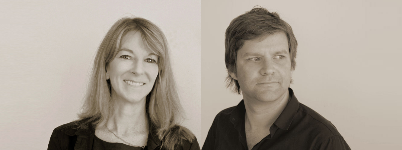
Spaceagency is a multidisciplinary firm from the United Kingdom which merge architecture with masterplanning, branding, graphic design and wayfinding. With a focus on the human experience, directors Sarah Manning, and Peter Feldmann and their team use a range of tools and research techniques to understand the layers of human movement and pattern in a site to create varying scales of graphic interventions which are thoughtfully integrated into architectural proposals across the globe. At the recent Australian Institute of Architects National Conference on the Gold Coast, Chelsea Doorne and Michael Smith sat down with Sarah Manning and Peter Feldmann to discuss their design approach and the importance of wayfinding to architecture.

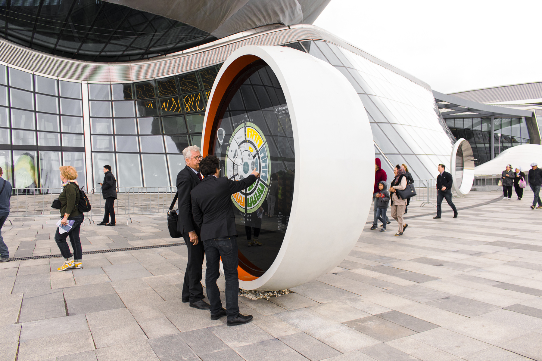
ASTANA Expo 2017
Photo by Peter Feldmann
Chelsea Doorne – Given how necessary collaboration seems in your schemes, at what point do you get involved with the architects you’re working with on these large-scale projects?
Sarah Manning – When we first started, we requested to get involved as early as possible. Some of our earliest projects we got involved right at the beginning. We’re part of the process – if it were a master plan, to look at how the space was laid out, to be involved in the concept stages and think about how we could elaborate on the concept, graphically, and from the very beginning take on the architectural principles. But over time we’ve realised it’s better to get involved when the architectural design’s more established, let’s say, after schematic design. Because often there’s so much change at the beginning, and because our work is a layer onto the architecture, that we would end up re-designing and re-designing because the architecture was changing. Now we tend to get involved around the end of schematic design and that still allows us to embed what we do into the architectural fabric, which is very important to us.
Peter Feldmann – On some projects it was useful when we got involved fairly early so that we could advise on a strategic level, say in a big master plan, where we could suggest connections that would make more sense from a wayfinding point of view. And then try to kind of argue or convince the architect and the client of the benefits of doing that.
Michael Smith – I imagine you need to have a strong cultural understanding of the place that you’re working within because, in the sort of work that you do, it would be very easy for misinterpretation. Can you explain a bit about that process? Do you involve the architect in that, or do you each do your own separate research into the cultural aspects of the project?
Sarah Manning – On almost any international project, or in the U.K., we will deep-dive into aspects about the place, the history, the people, whatever the use of the architecture is. For example, on the Dubai exhibition, the work I showed has actually changed quite a bit as we’ve incorporated this idea of weaving, from the Al Sadu tradition. It’s a heritage craft within the Emirates, and we’ve gone out onsite to meet weavers and understand how they work, the kind of pigments they use and the fabrics they use. So, we can sometimes go quite deep into first-hand research. Other times it’s more general research because the project doesn’t demand it. But it is quite important as there are different cultural readings.
First of all, quite often we work with two or three languages, and work with translators. There’s that aspect of the actual language and then there’s the aspect of the understanding, the initial research understanding the place. We go to some length on that.
Sometimes we’re doing it kind of side by side with the architects who are also doing that for the architecture. Sometimes we’re coming on board later, so we’re looking at a new aspect.
Peter Feldmann – In different contexts, colours have different meanings. For example, Russia…
Sarah Manning – We worked in Moscow. We were developing some flags and we thought it would be really sophisticated to have black flags. We presented this concept and the client came back and said, “This represents death for us!”
Peter Feldmann – In most Western countries black is not that strongly associated with death. But they had a very strong connotation, in that sense. In China, of course, red is kind of one of their favourite colours. The same also goes for numbers. In Japan, “4” is really bad luck. Numbers like “13” in Western countries is really bad because it’s really bad luck. Or in many Asian countries, number “8” is good luck and good fortune. A continuance of more levels of cultural relevance that come out of this research.
Sarah Manning – As you work in countries or regions, over and over, you start to know these things. It’s amazing, you build up this really esoteric knowledge about design.
Peter Feldmann – Different things that you wouldn’t necessarily know from the outside. As Sarah said, we really try to immerse ourselves on the project as much as we can by going to the site, by meeting a lot of people and talking to the client, and also just by being there and being part of the atmosphere and trying to understand it as much as we can. That’s a really, really important part of the work.
Sarah Manning – Our work is very much about place-making as much as it is about helping people. There’s an aspect of really taking the user’s point of view and helping them navigate and there’s an aspect about place-making and embedding what can be foreign architecture and making it more culturally rooted.

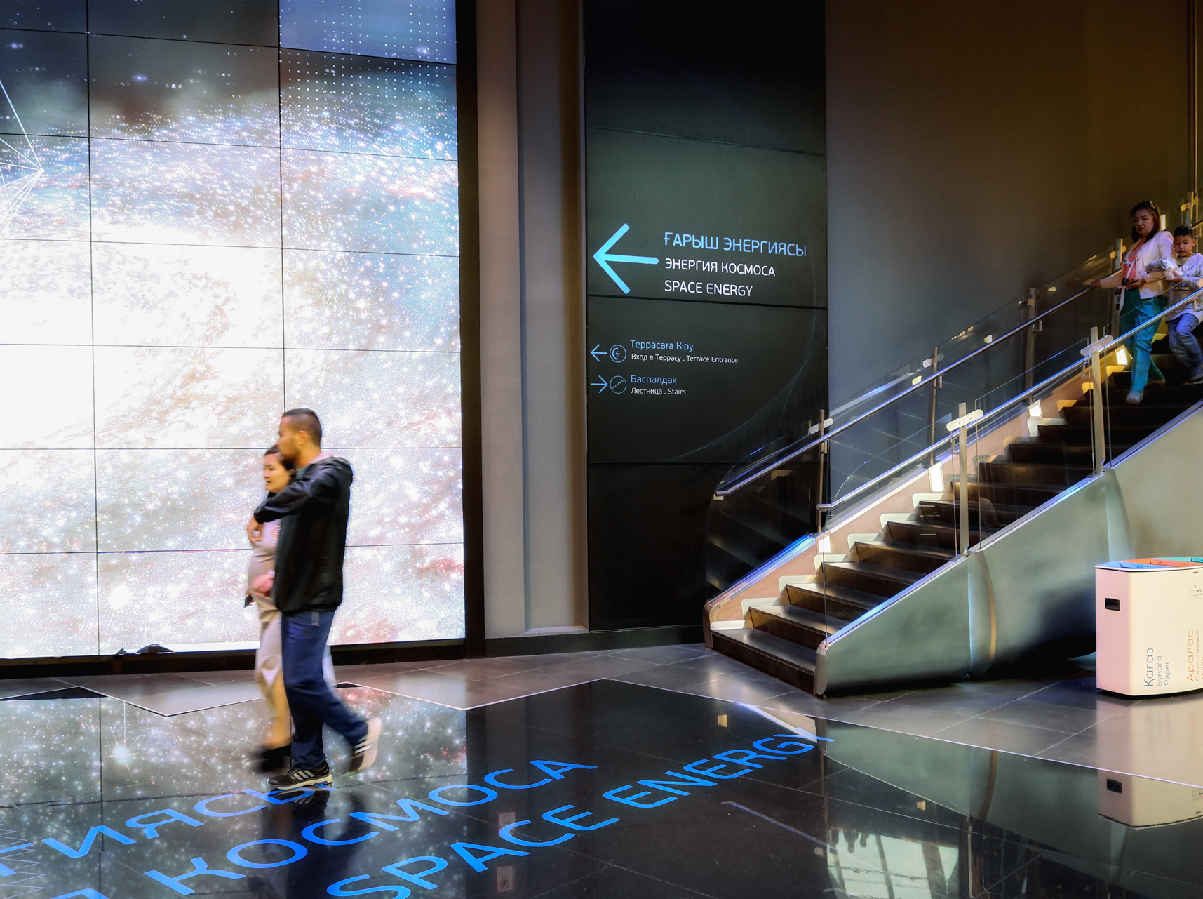
ASTANA Expo 2017
Photo by Peter Feldmann
Chelsea Doorne – What do you think architects need to be aware of when it comes to wayfinding?
Sarah Manning – Some of my thoughts on this come from my Space Syntax work. I worked at this spinoff out of DCL called “Space Syntax Limited” for about three or four years. There were a lot of findings that had come from user research and testing.
For example, if you’re trying to connect different buildings or elements, have them connect on level to the extent possible. People will avoid going up to go down. Or don’t have people turn back on themselves. So, if you’re designing a shopping centre and you’re putting in escalators, people will do everything to avoid turning back on themselves. Always try to keep people’s paths forward and to the greatest extent, level, if you want people to move in that direction. Don’t expect people to move backwards or to move up unnecessarily. You might end up with a project where you thought people were going to use two levels of pedestrian access, but they all stay on the lower one and the upper one isn’t well used.
For another example, we just worked on a competition for the V&A Museum in London. They have this amazing seven-story collection of buildings that are connected at different points. Some of them have more levels than the other ones and they don’t align perfectly. The biggest problem the V&A has, even though they have an international collection of amazing pieces, something like 80% of their visitors only ever visit the ground floor and never go up. They don’t go up because they don’t have good way-finding toward the lifts, so people can’t understand how the different levels connect as there isn’t good mapping. They’re really looking to overhaul that.

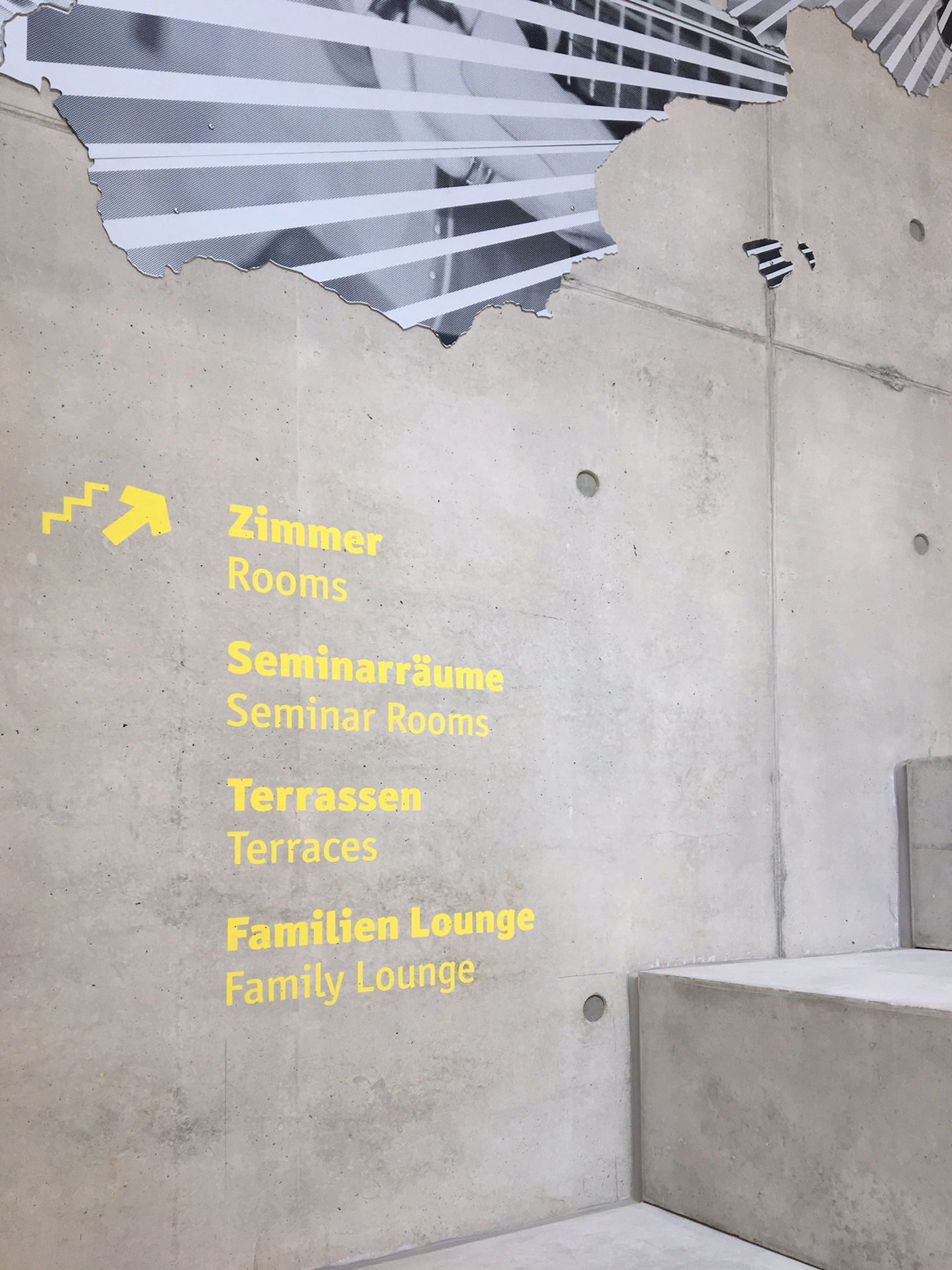
Bayreuth Youth Hostel
Photo: Hufton & Crow
Michael Smith – During the recent conference, Moshe Safdie presented some projects that utilize a ‘horizontal skyscraper’, on the 20th or 25th level to connect a series of towers. You can see that there’s immediately a question of how you instruct people to get up there. Do you see that as a challenge that can be easily overcome through design or is that scale too difficult?
Peter Feldmann – Those projects I would say probably the fact that there is something at a high level is such an important part of the design in itself, that it becomes so attractive that it overcomes the resistance from people to go vertically. Of course, when you talk about 23 levels nobody’s going to walk anymore. It becomes about the lift and the wayfinding of where the lifts are.
The other thing I wanted to add to the point before was architects, and I’m including myself because I worked as an architect before joining Space Agency, need to not leave topics such as wayfinding until too late in the process of the project, so that it doesn’t become an afterthought, like an element or object that gets stuck on to whatever they designed. Otherwise you’re in danger of ending up with a design that clutters the space. You’ve designed a beautiful architectural space and then, ah, “I need to put some signs up,” then it tends to be too late to create a solution that is successful. It needs to be integrated and smooth, not cluttered.
Of course, wayfinding is not just signage; it’s different from signage actually. I’d say the layout of the space is logical. In a way, predictable. Not meaning boring, but predictable in a way that you don’t create dead ends or weird connections that are irrational. There should be some way for the user to create a mental map of the space, like a big loop or like a number “8” that people can understand in principle. That will help to make the navigation intuitive, I suppose. Not relying on signage, but actually just the layout of the space. It helps with that.
Sarah Manning – During the recent conference, Borja Ferrater talked about systems as being one of his four principles. I think what Peter’s describing is very much about that systems layer that sometimes we think of as mechanical and electrical systems and structural systems. But we don’t think about circulation systems as much. But people, not just architects, actually intuitively understand circulation systems that are rational. Sometimes architects will design really unique spaces without thinking about how they function as a circulation system.
Michael Smith – Irrational spaces.
Sarah Manning – Yes. I was thinking about the transfer levels of the 25th floor. I think also sometimes you can programme these systems into the lift systems so that people have to transfer at that level. In a way, you’re not trying to attract people up by saying, “Look, there’s a great restaurant on that level,” as an attractor. You’re actually using the circulation system to get what space syntax calls “natural movement.” If they have to transfer at that level, then they see the restaurant, they have to come down and then you can be sure to activate the space.
I think there’s an idea out there from shopping malls and developers, that you just need to place attractors. Just place an anchor store or a McDonald’s, and people will be drawn to it. Actually, most movement is based on these linkages of space and the circulation system.
.
.
Click here to continue reading part 2 of this interview
Architecture is for everyone
Contact Us
Feel free to contact us with questions or feedback:
Latest Post
- A crisis of trust February 10, 2020
- The Square and the Park. October 28, 2019
- Fixing The Building Industry – A Wishlist September 12, 2019
- 2019 NATIONAL CONFERENCE DAY 2 June 24, 2019
- 2019 National Conference Day 1 June 22, 2019


Leave a Reply